Architecture: Tsimailo Lyashenko and Partners
Developer: Vesper
Project: Cloud Nine
Photo: Gorozhanin K.
Location: Moscow, RU
Exploring de luxe real estate projects is a unique pleasure. The anticipation before the shoot is akin to the excitement of a journey to a distant country. Often, the sites of such properties have a deep history, which will be revealed in today’s project. Cloud Nine is located between Polyanka and the Tretyakov Gallery, on a street adjacent to our office. Passing by every morning, I watched the construction progress with curiosity. I had a chance to talk with the team from Tsimailo Lyashenko and Partners, and Polina Murova — a representative of the developer Vesper (CN), gave me an excellent tour of the complex.
Let’s start.
GJ — In my opinion, the renovation process is technologically more labor-intensive compared to building from scratch. Could you tell us about the buildings before the renovation and which historical parts were preserved?
CN — Originally, the block was a single property combining residential and industrial functions. In the building with a facade on Bolshaya Polyanka, there used to be a printing house of the Menert brothers. It is known that they printed labels for the "Red October" confectionery factory. On the side of Staromonetny Lane, there is a former revenue house from the early 20th century with a classic facade and decorative molding. Deep in the block are a four-story mansion and another historical building, formerly part of the printing house. During the Soviet era, the buildings were heavily reconstructed, with added extensions and transitions, but a small part of the original elements in the printing house was preserved.
GJ — The complex consists of several blocks of buildings, separated by mosaic courtyards, with a color gradient from white to coal colors. I welcome architecture in dark shades, but people are very cautious about it. Why is that, and what role does color play in the Cloud Nine concept?
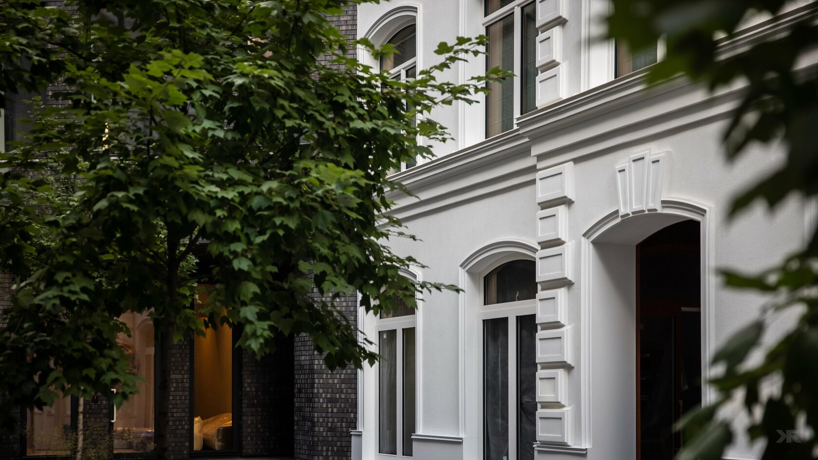
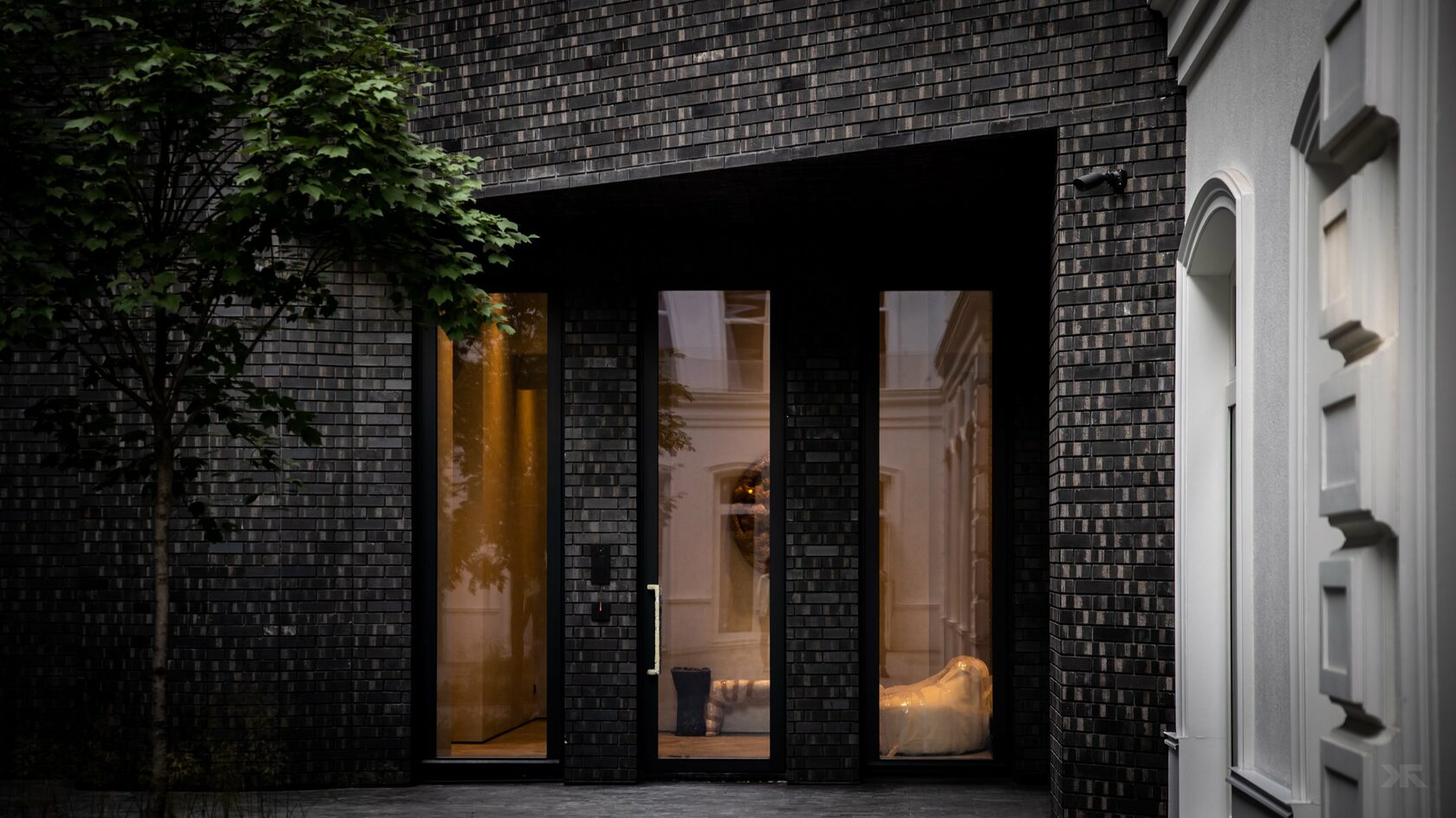
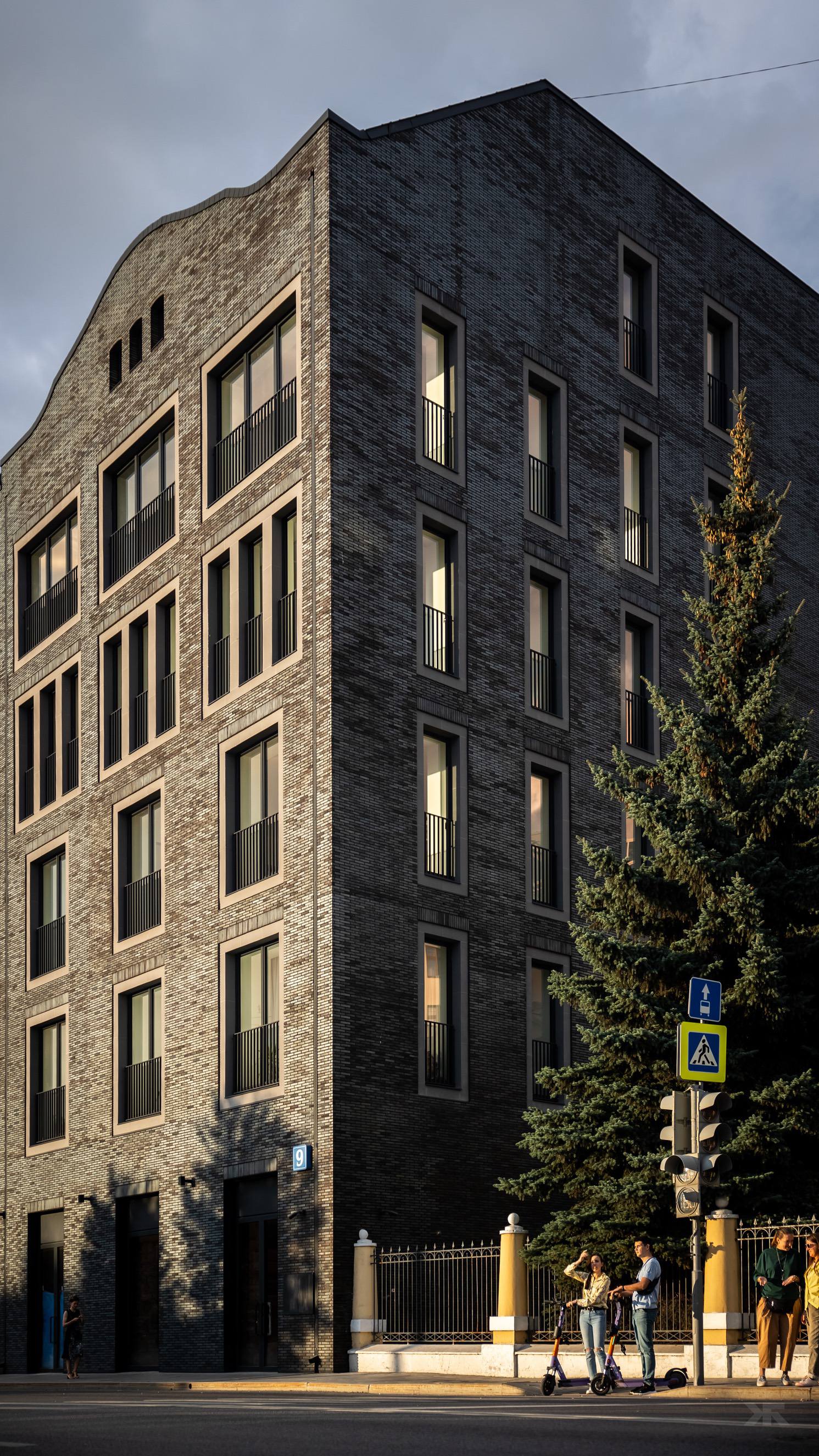
CN — We needed to unify the buildings into a single architectural ensemble, so we chose a monochrome color scheme. Some buildings retained their original color, like the one in Staromonetny — a revenue house with a bright facade. For the printing house, we chose a dark graphite palette: in our opinion, it successfully emphasizes the industrial past of the house, also reflected in the large windows. The facade facing Bolshaya Polyanka is clad in brick with a special coating. It contains reflective particles, changing the building’s appearance throughout the day. As for dark shades — they are probably less familiar and might seem gloomy, but it’s always a matter of appropriateness and the overall concept.
GJ — The low-rise historical buildings in Zamoskvorechye have their own architectural code, which is hard to confuse with anything else. Looking at the complex, I see that this code is reflected in your facades. Could you talk about the architectural features and how you managed to smoothly blend the historical code from classic to Russian style under one roof?
CN — The architectural concept is such that from the street, we see restored historical facades. They create a connection with the surrounding buildings; here, we didn’t invent anything special. The internal facades facing the courtyard, on the other hand, are very modern. It turns out that each house has a contrasting inner world.
CN — The architectural concept is such that from the street, we see restored historical facades. They create a connection with the surrounding buildings; here, we didn’t invent anything special. The internal facades facing the courtyard, on the other hand, are very modern. It turns out that each house has a contrasting inner world.
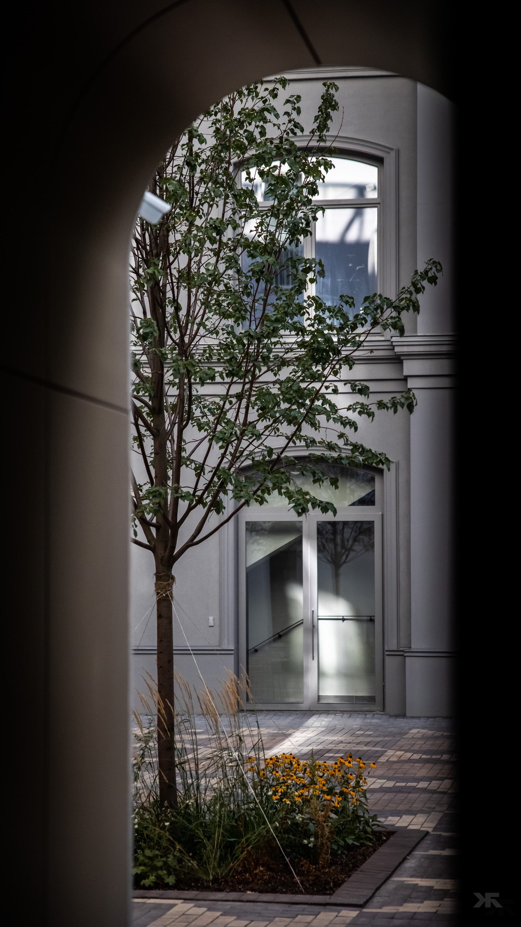
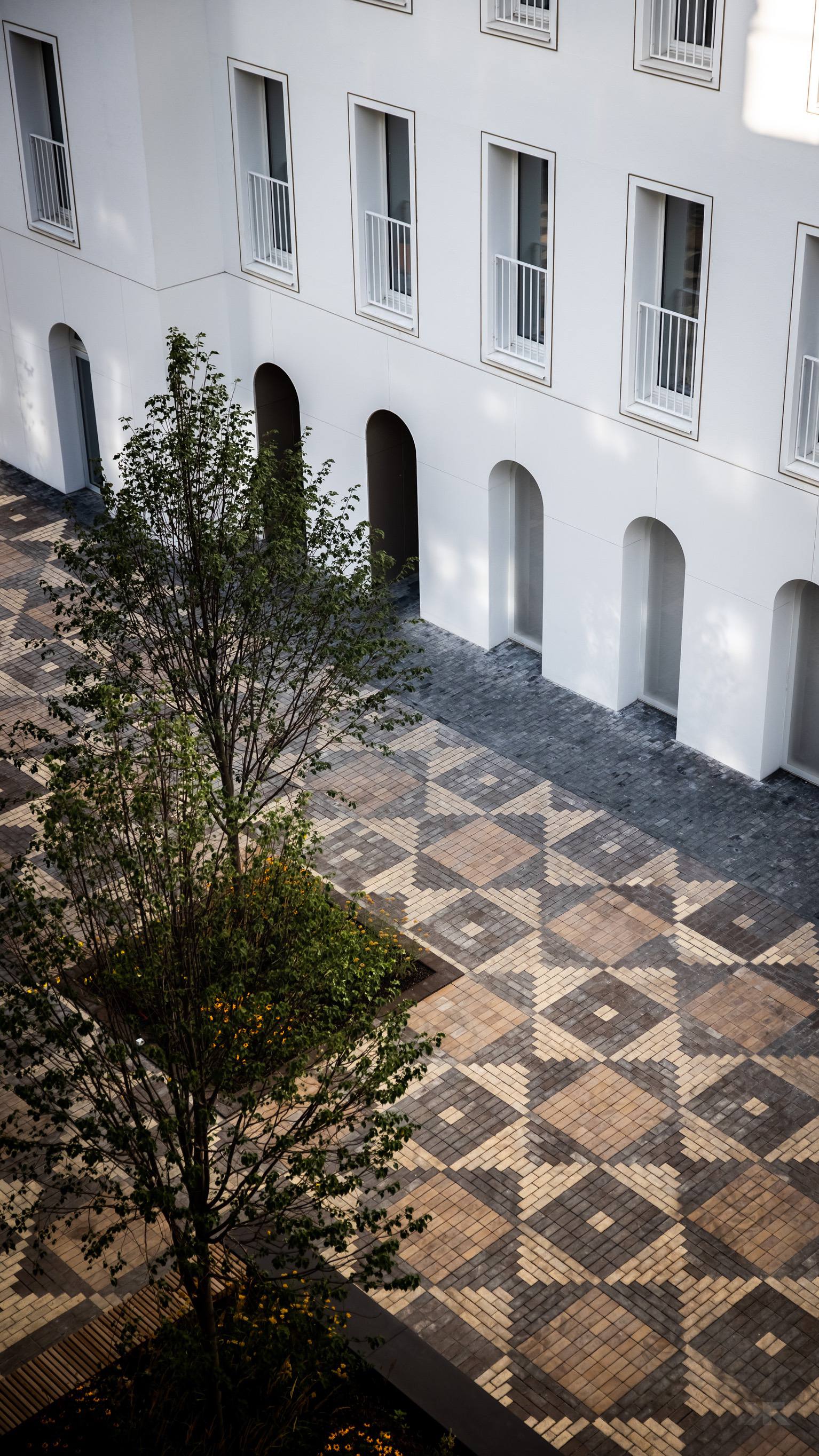
GJ — The most interesting things are always hidden from outsiders. I was impressed when I saw the inner courtyard spaces connecting the buildings. This is the "cherry on top" that fully reveals the facades. I haven’t seen anything like this in Moscow. Is the function of these spaces purely aesthetic?
CN — The function of the courtyards is simple — it’s a private area for residents, a buffer between the house and the street. We took the image of a dressed-up city square as a basis, so the landscaping includes bright paving that sets the tone for the entire space. You could say that this is our take on the traditional courtyard-well — its appearance can be quite different.
Conclusion
Building within the historical part of the city is always a non-trivial task. It’s crucial to ensure that the modern construction blends organically into the environment while bringing something new. In my opinion, the guys from CLP and Vesper have created another masterpiece that is definitely worth noticing.
PS The heated sidewalks turned out to be especially relevant this season.